Catchment analysis with drive-time polygons, not ZIP codes. Retail, healthcare, franchise examples, and the 70/20/10 rule that does and doesn't hold.
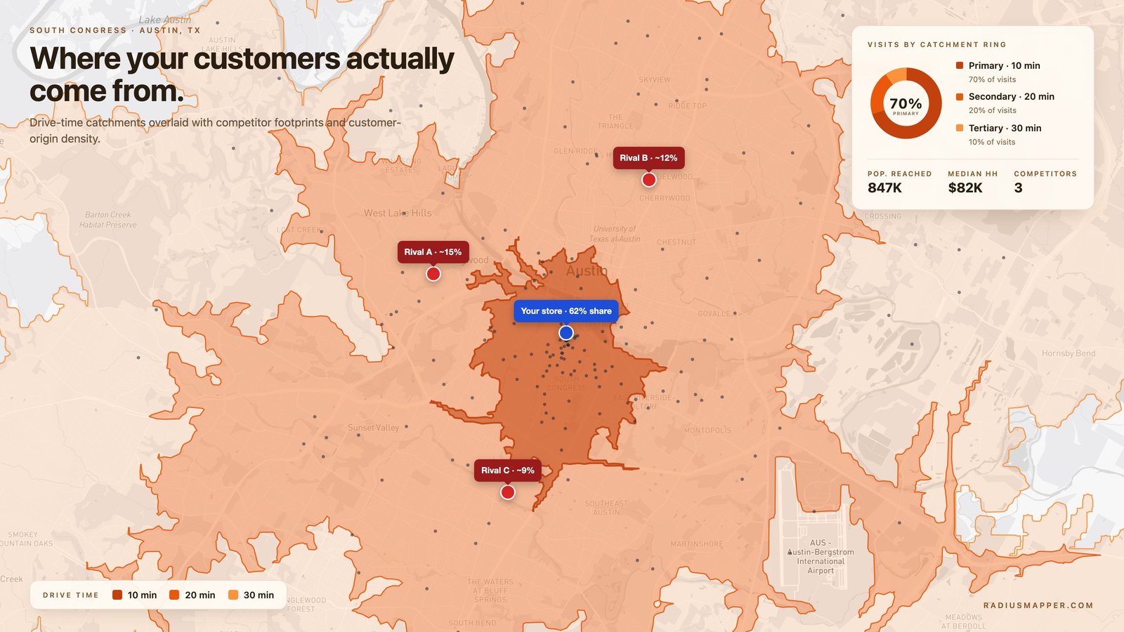
Starbucks opened its 30,000th global location in 2019. By that point the site-selection team had a 400-variable model. None of the variables were ZIP codes.
Most independent retailers still start there. Pull demographic counts for the ZIP, benchmark the competitive set, model revenue, sign the lease. Months later the loyalty data comes in and half the actual customers live outside the ZIP the model ran on. The site is fine; the boundary was wrong. ZIP codes were drawn to route mail, not to predict where humans are willing to drive for a latte.
Catchment area analysis, done with travel time instead of mail routing, is what Starbucks and every other serious multi-unit operator does instead. This guide covers how it works, where the methodology differs by industry, and the five mistakes that quietly sink forecasts.
A catchment area is the geographic region from which a location draws its users. Customers for a store. Patients for an urgent care. Students for a public school. Callers for a 911 dispatch center.
The analysis is two things stitched together: (1) drawing the boundary correctly, and (2) looking at who lives inside it. The drawing-the-boundary part is where most teams go wrong. If you use a ZIP code, a radius circle, or a county line, you're using a boundary that has nothing to do with how people actually reach your location. Modern catchment analysis uses drive-time or walk-time polygons, irregular shapes that follow roads and honor physical barriers, because those are what customer behavior actually respects.
The inside-the-polygon part is demographics, competition, and behavior: who lives there, how many competitors they pass between home and your door, and how often they need what you sell.
Retail practitioners split catchment areas into three concentric rings and apply a shorthand: the primary ring generates about 70% of customers, the secondary about 20%, and the tertiary about 10%. The rule holds up well across convenience retail, 7-Eleven, Dunkin', Sheetz, corner grocers.
It stops holding up for destination categories. IKEA's primary ring is roughly 45 minutes and still accounts for only 55-60% of customers, because the category itself (large furniture, once-a-year purchases) pulls from much farther away. Costco's primary ring is similar. A rural cancer center's primary might include a 90-minute drive-time polygon and still only produce 50% of patients, because cancer care is a destination too.
The useful takeaway: start with 70/20/10 as a null hypothesis, then verify against real data. Every category you model should have its own ratio fitted to actual customer origins.
Each ring asks for a different strategy, which is the whole reason to bother splitting them apart.
The mechanics are the same whether you're opening a Pure Barre studio or siting a fire station. A worked example keeps it honest, say a specialty coffee shop at 1900 S Congress Ave in Austin, evaluating a second location a few miles north.
Pin the origin precisely. Use latitude/longitude, not a street name. A few hundred feet of offset can move the polygon across Lamar Boulevard or past the I-35 frontage road, which materially changes the shape. For walk-heavy urban sites, decide upfront whether the origin is the storefront door, the parking entrance, or the nearest transit stop, each gives a different answer.
Pick the boundary method. Five options, descending in quality:
Compute the polygon. Generate 5-, 15-, and 30-minute drive-time isochrones for primary, secondary, and tertiary. For South Congress, add a 10-minute walk isochrone too, the district has enough pedestrian morning traffic that ignoring it biases the forecast low.
Overlay the demographics. Population, median income, age mix. The variable that matters most for a morning coffee shop isn't residential population, it's the daytime-to-residential ratio. Downtown Austin has a daytime count several multiples of its overnight population. Modeling a 7 AM coffee business on Census residential counts misses the commuters who'll drive 80% of weekday revenue.
Map the competition. Every direct rival inside the primary and secondary rings. Inside the polygon, not inside a radius. Note whether a competitor sits between your proposed site and the densest residential cluster, those are the customers you lose before they ever see your sign.
Compute addressable demand. The formula is: daytime population × category penetration × capture share. For specialty coffee in Austin, category penetration runs around 2-3 purchases per week per potential customer in the target demographic. Capture share against a competitive set is usually 15-30% for a differentiated independent, higher for a strong chain, much lower for a weak one.
The output is a tiered map with demographics, competitor overlay, and a demand estimate. Ten minutes per site with a modern tool, versus the two weeks it used to take with paper maps and a Census CD-ROM.
The headline methodology choice is drive-time versus distance radius. It's not close.
A 5-mile radius drawn at our South Congress origin sweeps across Lady Bird Lake to the north (crossing water that a car cannot cross without detouring to the Congress Avenue Bridge), ignores the fact that I-35 concentrates a 20-minute drive corridor along the east side, and treats the dense urban grid north of the river as identical in accessibility to the suburban stretches to the south.
A 15-minute drive-time polygon drawn at the same origin follows the Congress bridge north, bulges along Mopac/Loop 1 to the west, extends along I-35 to the north, and contracts everywhere the traffic signals and left-turn restrictions slow drivers down. That shape is the honest answer to "who can realistically make it to the shop for a morning coffee?"
The accuracy gap isn't marginal. A 2023 methodology comparison published by Esri Business Analyst found that drive-time catchments predicted observed customer origins about 2.5× more accurately than equal-area radius catchments across 14 QSR chains. Measured at the portfolio level, a grocery chain evaluating 50 candidate sites using radius methods will misrank enough of them that the final network is measurably suboptimal, usually on the order of 8-15% in long-term revenue per site.
Radii are fine for a one-minute sanity check. They are not fine for a lease signature.
The workflow takes about five minutes per site.
Open trade area analysis (or start from the free driving radius tool if you just need the drive-time shape without demographics). Drop a pin at the exact storefront address. Generate three isochrones, 5, 15, and 30 minutes, and save them as primary / secondary / tertiary. If the district is walkable, add a 10- or 15-minute walk polygon at the same origin.
Flip on demographics. The panel shows population, income, age mix, and the daytime-to-residential split inside each ring. Drop competitor pins or upload a CSV of rival locations; the tool flags which fall inside each ring and lets you subtract their trade area from yours.
Export: PDF for an investment deck, GeoJSON or Shapefile for a GIS handoff to the real-estate team, CSV for the demographic rollup.
For multi-site work, stack polygons across candidate locations on the same map. Overlap between two proposed sites' primary rings is cannibalization risk, and the tool quantifies it so you can compare "how much do these two stores eat each other" across options. The same underlying logic wires into the broader site selection workflow if you're screening against dozens of sites at once.
The methodology is the same across industries. The numbers are very different.
Coffee, QSR, and convenience: 5-15 minute primary, 15-30 minute secondary. Panera and Chipotle target roughly 10-minute primary drive-time for most locations; Dunkin' builds density around 3-minute primaries in urban cores and 8-minute primaries in suburbia. Destination retail (Costco, IKEA, Nordstrom Rack) flips to 30-45 minute primaries because the category justifies a dedicated trip.
The signal you want to calibrate against: loyalty data from an existing location. If 70% of your current customers at the flagship live within a 12-minute drive, your primary ring for the next site is a 12-minute isochrone. Not 5 miles.
Medicare Advantage plans operate under CMS network adequacy rules that specify minimum travel time and distance to primary care, specialists, and hospitals by county type, urban, suburban, rural, county-extreme-access, with different thresholds per category. The full matrix is in the CMS Medicare Advantage regulations; urban primary-care access is typically 5 miles or 10 minutes, while rural specialists can extend to 90 minutes. Health plans that model this with radii get flagged on audit in mountainous or river-divided geographies because a radius doesn't respect the bridge or the pass.
Urgent care chains, MedExpress, FastMed, American Family Care, target 10-15 minute drive-time primaries. Hospital catchments are much wider: a 45-minute drive-time polygon is typical for a regional hospital, and quaternary care like major cancer centers can draw from 3-hour catchments.
NFPA 1710, the national standard for career fire department deployment, recommends a 240-second (4-minute) travel time benchmark for the first-arriving engine company on fire suppression responses, measured at the 90% performance level. That's a travel-time catchment problem, not a distance problem, station placement has to ensure that every address falls inside a 4-minute polygon, which in dense cities means stations every 1.5-2 miles and in rural areas means impossible. ISO Class 1 fire protection ratings (the best insurance-rating class) partially depend on documented compliance with these travel-time catchments.
EMS uses a similar 8-minute standard for life-threatening calls in most urban systems.
Public school catchment zones are administrative boundaries that assign students to schools. Districts use walk-time + drive-time analysis to plan bus routes, redraw boundaries when enrollment shifts, and evaluate equity of access, the US Department of Education has specific guidance on how catchment boundaries interact with Title VI racial equity requirements. A district that draws catchment boundaries based on street maps without considering walk-time often creates "5 minutes by car but 45 minutes by bus with two transfers" access problems that show up later in attendance data.
Franchise agreements often define territory with a radius, 3 miles, 5 miles, because radius is simple to draft. The edge cases are dumb: a neighborhood "belongs to" a franchisee 25 minutes away on actual roads because a crow-flies line happens to clip it. Territory drawn as a drive-time polygon is harder to dispute in court and actually reflects the zone where cannibalization occurs.
Subway learned this the expensive way in the 2010s, the chain's 1,000+ internal cannibalization disputes traced largely to radius-based territory language in older franchise contracts. Newer franchise agreements across McDonald's, Chick-fil-A, and Wingstop specify drive-time polygons.
Delivery economics break past a 15-minute drive-time radius from the fulfillment point. A catchment that respects arterials and bridges is the difference between a profitable last-mile operation and a money-losing one. Whole Foods' in-house delivery caps around 15 minutes from the store. Instacart's model tolerates longer catchments because shoppers are distributed, not centralized.
Using a radius when drive-time would have been honest. The #1 error. A radius model drawn over a river, a highway, or a mountain produces a catchment that looks fine on a slide and fails in reality. Replace every radius in your workflow with an isochrone.
Modeling a lunch business on residential population. A downtown office block has a small residential count and a massive daytime one. Suburban subdivisions are the opposite. Picking the wrong population base biases the forecast by 40-80% in either direction.
Ignoring the competitor sitting between you and the customer. A theoretical catchment includes every potential customer inside the polygon. In reality, half of them pass a Chick-fil-A on the way to your Cava. The competitive overlay step isn't optional.
Using a 2022 catchment in 2026. New highway interchanges, transit line openings, major construction projects, and traffic pattern shifts all redraw isochrones. Atlanta's I-285/GA-400 interchange rebuild, finished in 2020, moved the 15-minute drive-time boundary by up to 8 minutes in some directions for sites near Perimeter Center. Any model older than the last major road change is wrong.
Borrowing national-average capture rates. Category penetration for specialty coffee in Austin is not the same as in Cleveland. Calibrate against your own stores in comparable markets, not a generic industry deck. If you don't have your own data yet, pull from chains with published same-store sales in comparable metros.
RadiusMapper. Web-native, free tier for drive-time and walk-time isochrones via the driving and isochrone-map tools, paid tier for demographics and the full trade area analysis workflow. API-first if you need to embed catchment logic into internal tools.
Esri Business Analyst. Enterprise gold standard. Expensive (starts around $6k/user/year), powerful, and the learning curve is real. The right choice if your team already lives in ArcGIS.
Placer.ai. Foot-traffic intelligence, catchments inferred from observed mobile device trajectories, not modeled from road networks. Strong data, high price point (~$40k/year for small teams), best used alongside isochrone analysis rather than instead of it.
Smappen. Web-native, popular with solo analysts and small agencies. Good isochrone quality, lighter on the data enrichment side.
QGIS plus OSRM or Valhalla. Free if your team can configure an open-source routing engine and load the base data. Infinitely flexible, but someone needs to own the setup.
Most teams end up using two tools: one for fast visual work, one for heavy analytical firepower. RadiusMapper + Placer.ai is a common pairing for mid-market retail.
Same concept, different dialects. "Trade area" is retail industry shorthand. "Catchment area" is the broader term used in healthcare, education, emergency services, and urban planning. If you move between industries, "catchment area" travels better. If you only do retail, either works.
The honest answer is that "radius" is the wrong framing, the question is what drive-time polygon captures 70% of real customers, which varies by format. Convenience retail runs 5-15 minutes, roughly a 3-7 mile radius in suburban geographies, less in urban ones. Destination retail reaches 30-60 minutes. For any specific decision, calibrate against your own customer data instead of an industry average.
Yes for the boundary work. Free isochrone tools draw drive-time or walk-time polygons from any address in seconds. What you pay for is demographic enrichment, competitive data, and multi-site workflows. For single-site exploration, a free tier is genuinely enough.
Annually for active sites. Immediately after any significant network change, new highway ramp, transit line opening, major competitor entry or exit, large construction project. These events can shift a 15-minute boundary by 5-10 minutes in specific directions, which changes the population inside the polygon by 10-20% even when demographics are flat.
For convenience and QSR retail, yes, reliably. For destination categories (furniture, specialty medical, outlets, Costco-style big-box), it flattens to something more like 45/30/25. The rule is a sanity check, not a physical law. Always verify against real customer origin data when you have any.
Across 14 QSR chains, Esri found drive-time catchments predicted observed customer origins ~2.5× more accurately than equivalent-area radius catchments. The gap compounds across a portfolio, a chain evaluating 50 sites with radius models will misrank enough to cost 8-15% in long-term revenue per site. For any decision with real financial stakes, the time to switch was yesterday.
 RadiusMapper