Isochrone maps visualize travel-time reach. Definition, how they work, real uses, and how to make one, plus the history from Galton 1881 to 15-minute cities.
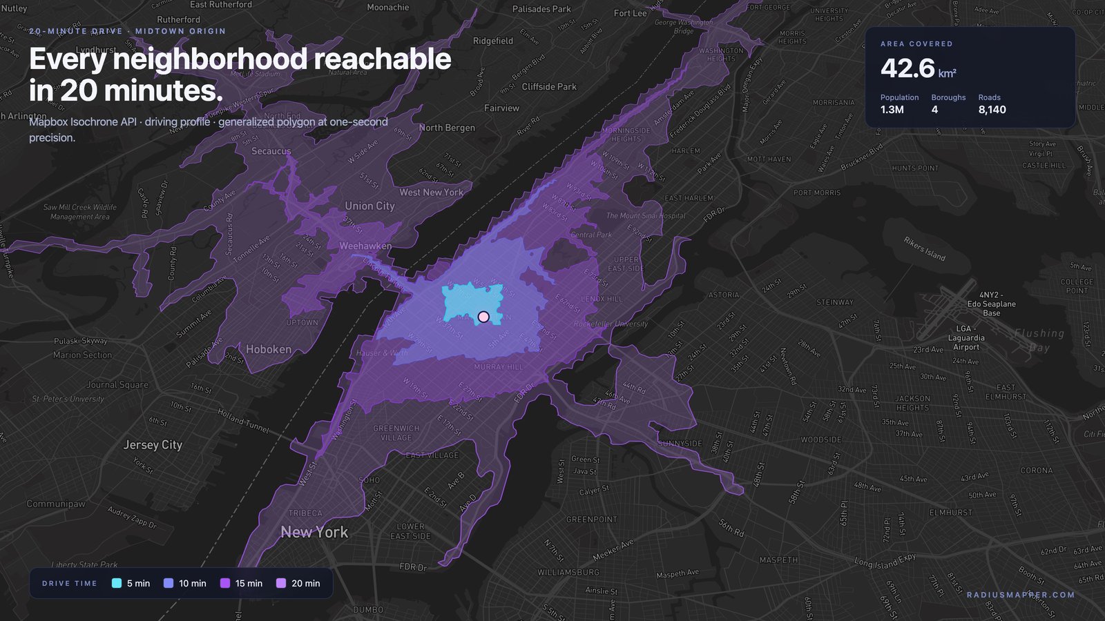
Imagine your mother wants to run three errands after work -- the pharmacy, the grocery store, and home -- with thirty minutes before dinner. A straight-line radius around her office tells you nothing useful about whether the trip is possible. It ignores one-way streets, highway access, traffic lights, and the river between her office and the pharmacy. To answer the question honestly, you need a map that shows how far a person can actually travel in thirty minutes, following real roads. That tool is called an isochrone map, and once you understand how it works, a plain radius circle starts to look like a crude approximation of the world.
An isochrone map is a visualization that shows every place reachable from a single starting point within a specified travel time, using a chosen mode of transportation. Unlike a circle, which measures straight-line distance and ignores the physical world, an isochrone follows real road networks, pedestrian paths, or transit routes, so the resulting shape reflects actual accessibility rather than theoretical distance. The boundary of the shape -- the isochrone line -- marks the outer edge of what you can reach within your time budget.
In plain English: a radius asks "how far?" An isochrone asks "how far can I actually get?" The second question is almost always the one you care about. You can generate one in seconds using RadiusMapper's free isochrone map tool.
The word isochrone comes from the Greek iso (equal) + chronos (time) -- literally, "equal time." The line connects all points at the same travel-time distance from the origin.
The first well-documented isochrone map was published in 1881 by Francis Galton, the Victorian polymath better known for statistics and heredity. Galton's "Isochronic Passage Chart for Travellers" showed travel time from London to the rest of the world in shaded bands -- ten days to reach the eastern United States, forty days to reach Sydney. It was the first time anyone had visualized the planet in terms of time rather than distance, and it remains a landmark of thematic cartography.
Isochrones faded from mainstream mapping for most of the twentieth century until GIS and fast routing engines made them cheap to compute. The concept returned to public attention with the 15-minute city movement, introduced by Carlos Moreno in 2016, which uses isochrones as the operational definition of a walkable neighborhood. Wikipedia's isochrone map entry traces the lineage in more detail.
An isochrone is the output of a routing algorithm running over a network graph. The inputs are simple: an origin point, a travel mode (driving, walking, cycling, transit), and a time budget in minutes. The output is a polygon -- sometimes a MultiPolygon with holes, where the network has unreachable pockets -- enclosing every location reachable inside the budget.
The routing engine treats the road network as a graph. Intersections are nodes; road segments are edges. Each edge has a traversal cost in seconds, derived from its length and an assumed speed. Speed varies by road class (a highway edge is faster than a residential edge), by mode, and in some systems by time of day.
Starting from your origin, the engine runs a shortest-path algorithm -- typically Dijkstra's algorithm, sometimes A* with a geographic heuristic, or contraction hierarchies for large networks. It expands outward, visiting nodes in order of increasing travel time, until every node inside the budget has been reached.
Once the set of reachable nodes is known, the engine wraps them in a polygon using concave hulls, alpha shapes, or gridded interpolation -- each with trade-offs between smoothness and faithfulness to the network.
An isochrone is almost never a smooth blob. It reaches outward along highways, stretches thin across bridges, and stops abruptly at rivers, one-way streets, and limited-access interchanges. That irregularity is the point -- it reflects the real geometry of the network. A ten-minute driving isochrone in Manhattan looks nothing like a ten-minute driving isochrone in suburban Phoenix, even though both are labeled "ten minutes."
These three terms get used interchangeably, and they should not be.
A radius or buffer is a circle drawn at a fixed straight-line distance. It is easy to compute and completely blind to the road network. A five-mile buffer around a downtown office includes large portions of a neighboring suburb and excludes parts of the same city across a freeway with no access. Buffers are useful for quick screening and for legally defined distances -- a school's drug-free zone, or the 150 air mile radius in federal trucking rules -- where the regulation specifies straight-line measurement.
An isochrone is a time-based polygon built from the actual network. It answers a different question: not "how far from the origin?" but "how much ground can I cover in X minutes?"
The difference is usually dramatic. A ten-minute driving isochrone in a dense gridded city typically covers 40-60% less area than a circle of the same average radius, because streets zigzag, dead-end, and bottleneck at bridges. In a sparse rural area with a single highway, the isochrone stretches along that highway well past the radius on one side and falls short on the other.
For any question about how a person actually moves -- commute, customer reach, hospital access -- the isochrone is the correct tool. The buffer is a proxy that made sense when computing isochrones was expensive. It no longer is.
Once you recognize the pattern, you start seeing applications everywhere.
Real estate search. "Find me homes within a thirty-minute drive of the office" is an isochrone query. A thirty-minute driving isochrone around a workplace, intersected with a listings database, returns only the homes that actually qualify -- unlike a distance filter, which surfaces listings across rivers and highways that take an hour to reach.
Retail site selection. The standard trade area for a quick-service restaurant is a 10- or 15-minute drive. Teams use isochrones to estimate households inside a proposed site's trade area, compare it to existing stores, and detect cannibalization between locations. RadiusMapper's trade area tool wraps this workflow and overlays demographic data at the neighborhood level inside the polygon.
Delivery and logistics. A ghost kitchen promising hot food in twenty minutes needs a twenty-minute delivery polygon, not a three-mile circle. Isochrones define the honest service boundary.
Urban planning and walkability. The 15-minute city concept is built around a walking isochrone: every resident should reach essentials -- grocery, school, clinic, park -- within a 15-minute walk. Planners use walking and cycling isochrones to measure how well neighborhoods meet the standard.
Emergency services planning. Fire departments model response times against benchmarks -- the commonly cited NFPA 1710 target is a four-minute travel time for the first-arriving engine company. An isochrone from each station at that budget shows coverage; overlapping those polygons with the population grid reveals gaps.
Healthcare access. Regulators and payers set drive-time standards -- "a primary care provider within a 30-minute drive" or "an in-network hospital within 45 minutes." Network adequacy analysis is an isochrone problem.
Transit and equity analysis. Comparing a transit isochrone with a driving isochrone from the same origin quantifies the accessibility gap between car owners and non-car owners.
Political campaigns and public outreach. Campaigns model drive times from polling locations to find neighborhoods where long travel times depress turnout. Agencies running public hearings use the same analysis to pick accessible venues.
Academic research. GIS and public-health literature uses isochrones to quantify access to food, green space, care, and employment.
The mode of travel is the most important parameter after time budget.
Driving isochrones weight the road network by posted or historical speeds, prefer highways, and respect one-way streets. A 30-minute driving polygon in a major city can span dozens of square miles.
Walking isochrones use the pedestrian network -- sidewalks, paths, crosswalks -- at a pace around 5 km/h. They ignore vehicle-only roads and are typically much smaller and smoother than driving polygons.
Cycling isochrones prefer bike infrastructure, assume roughly 15 km/h on flat terrain, and in higher-fidelity systems apply elevation penalties. A 15-minute cycling isochrone usually covers three to four times the area of a 15-minute walking polygon.
Transit isochrones blend walking with scheduled bus or rail service. They are hard to compute honestly because wait time varies with the clock -- a 9:03 AM departure and a 9:23 AM departure can yield very different polygons.
Multi-modal isochrones combine walk, bike, and transit into one polygon. Most tools approximate this; few do it well.
Several tools will generate an isochrone for you.
Start at RadiusMapper, and move to a programmatic tool only if you need isochrones in bulk.
Accuracy depends on three things: the quality of the road network, the realism of the edge speeds, and whether the tool models traffic.
Most consumer isochrone tools are built on OpenStreetMap, which is detailed and well-maintained across most of the developed world and thinner elsewhere. A missing alley or mis-tagged one-way street can shift the polygon noticeably in dense urban cores.
Edge speeds are where tools diverge most. Some use constant speeds per road class. Better systems blend posted limits with historical probe data for realistic time-of-day averages. The best systems incorporate live traffic, though "live" only applies at query time.
Different tools therefore produce different polygons for the same inputs, and that is normal -- they make different modeling assumptions. For planning questions, polygon shape and rank-ordering matter more than any individual pixel. For real-time dispatch or ETA, a traffic-aware engine is worth paying for.
An isochrone is a model, not a photograph.
Parking, door-to-door walk time, elevator waits, and the last-hundred-feet problem are generally ignored. A fifteen-minute driving polygon around a downtown tower does not account for the seven minutes you will spend circling for a garage.
Traffic models are probabilistic. A polygon built from a Tuesday 10 a.m. average will understate your commute on Friday at 5 p.m. and overstate it at 2 a.m. Sunday. For time-sensitive cases, confirm which traffic condition the tool is modeling.
Speed assumptions also vary by country, tool, and region. A "15-minute walking polygon" is not a universal measurement; compare across tools carefully.
People sometimes type "isochronous map" or "isochrome map" when they mean isochrone. An isochrone is a line or polygon of equal travel time. "Isochronous" is an unrelated adjective in physics meaning "occurring at equal intervals of time." A map showing equal-time reach is an isochrone map; "isochrome" is almost always a spelling mistake for isochrone.
Google Maps does not expose isochrones in its consumer interface. You can measure point-to-point travel times, but you cannot draw a polygon showing everywhere reachable in X minutes. For that, use a dedicated tool like the free RadiusMapper isochrone map, OpenRouteService, or a desktop GIS package. Google's Distance Matrix API can be scripted to approximate an isochrone, but it is far slower than a purpose-built routing engine.
Accurate enough for most planning and decision work, and less accurate than live GPS routing for a specific trip. The polygon is a statistical model of typical travel times on a typical day. Use it to compare neighborhoods, screen locations, or estimate service coverage; verify with live routing before betting on a specific arrival time.
A 15-minute isochrone is a polygon showing everywhere reachable from the origin within fifteen minutes. The shape depends on the mode: a 15-minute driving isochrone can span many miles, a 15-minute walking isochrone covers a half-mile to one-mile reach, and a 15-minute cycling isochrone falls between. The 15-minute walking polygon is the operational core of the 15-minute city concept.
Most modern isochrone tools export polygons as GeoJSON, the de facto interchange format for web GIS, which loads directly into QGIS, ArcGIS, and most mapping libraries. Shapefile export is standard in desktop GIS tools and available in some web tools. If you need a specific format, check export options before committing to a provider.
In GIS, an isochrone map is a vector layer -- typically a polygon or MultiPolygon feature -- representing the reachable area from an origin within a time budget. Analysts intersect it with population, parcels, or points of interest; compute areas; compare across origins; or combine polygons for coverage and gap analyses. It is a building block for accessibility analysis.
The earliest widely cited isochrone map is Francis Galton's 1881 "Isochronic Passage Chart for Travellers," showing travel time from London to the rest of the world. Earlier proto-isochrones exist, but Galton's chart is the one most commonly credited as the first of the genre. Modern computational isochrones are a product of late-twentieth-century GIS and routing research rather than a single inventor.
An isochrone polygon is the shape produced by the routing calculation: a closed boundary enclosing every point reachable within the time budget. Complex networks often yield MultiPolygons with holes, where isolated unreachable pockets sit inside the broader shape. Polygons are the standard output because they are easy to render, intersect with other data, and transmit as GeoJSON.
An isochrone map is the honest version of "how far." It replaces the straight-line circle with a polygon built from the roads, sidewalks, and transit lines a person actually uses, and in doing so it answers the questions that drive real decisions: where to live, where to open a store, how to staff an ambulance district, whether a neighborhood qualifies as walkable. Once you have seen a proper isochrone for your own address, the old radius starts to feel like a sketch rather than a description.
Try the RadiusMapper isochrone map -- free, no signup, no API key, instant results.
 RadiusMapper